
Capital One
Travel Servicing
Email Design
Graphic Design
✳︎
UI Design
✳︎
Component Management
✳︎
User Testing
✳︎
Research
Graphic Design ✳︎ UI Design ✳︎ Component Management ✳︎ User Testing ✳︎ Research
The Problem
Capital One Travel needed to communicate critical servicing and transaction information to customers who had low awareness of the product, low confidence in post-booking support, and crowded inboxes competing with OTAs and direct airlines. Existing emails were fragmented and inconsistent, making it difficult to build trust, reinforce a premium brand perception, or create future opportunities to drive deeper product usage.

Considerations
Target audience
Affluent millenial with a Capital One premium card
HHI >$200k
FICO, a credit score >720
$30-75K annual credit card spend
Barriers to entry
Low confidence in servicing
Low awareness of Capital One Travel
Inventory & price vs. OTAs/direct booking
Overwhelming inboxes
We want our audience to open Capital One Travel servicing emails, and connect them with the aspirational sentiment from our marketing.
Hypothesis
If we intentionally structured Capital One Travel emails using a cohesive design system and modular content approach, then we could improve clarity and trust in servicing communications, reinforce a consistent premium brand experience, and create a scalable foundation for future upsell and feature adoption without increasing cognitive load in an already noisy inbox.
Testing & Implementation
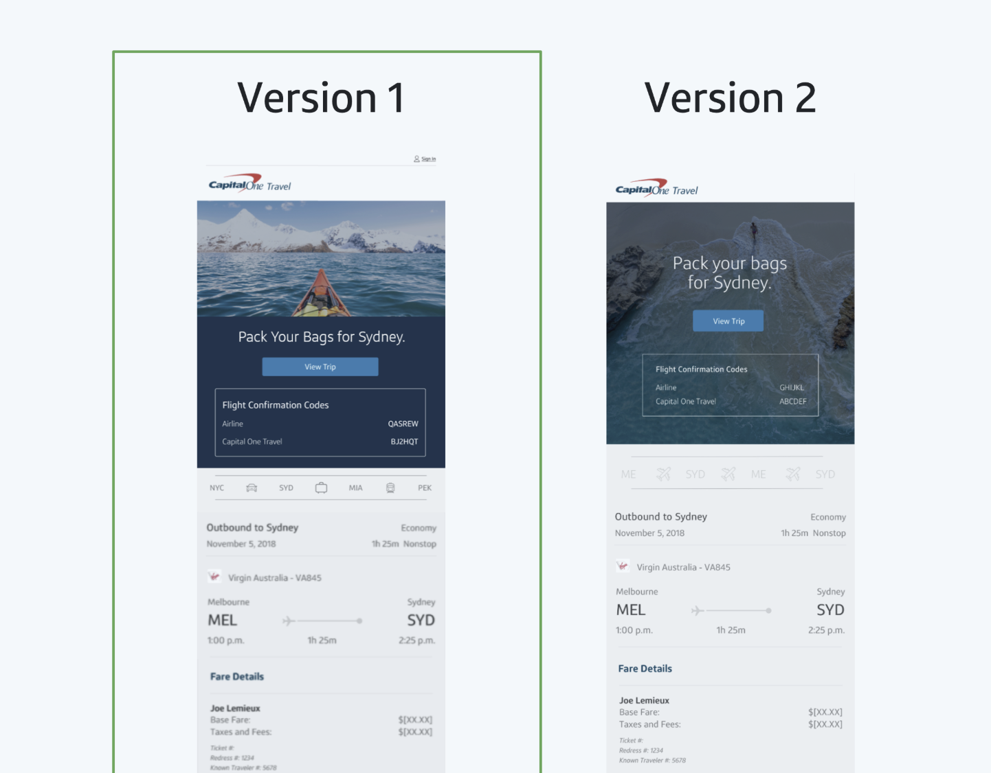
We tested two designs before launching the full redesign using user testing. Our goal was to gauge customer sentiment and preference between 2 email creative designs. Here’s how we tested it:
Qualtrics survey via Usertesting.com user panel (n= 53)*
Show each version to users and ask for their feedback on each
Then show side by side and ask which design is preferred
*Screening Criteria: Must be a Mobile banking user in the past 3 months, has a credit card, and is a Capital One customer
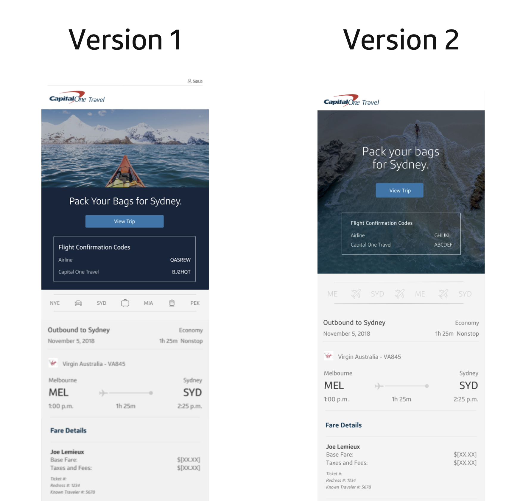
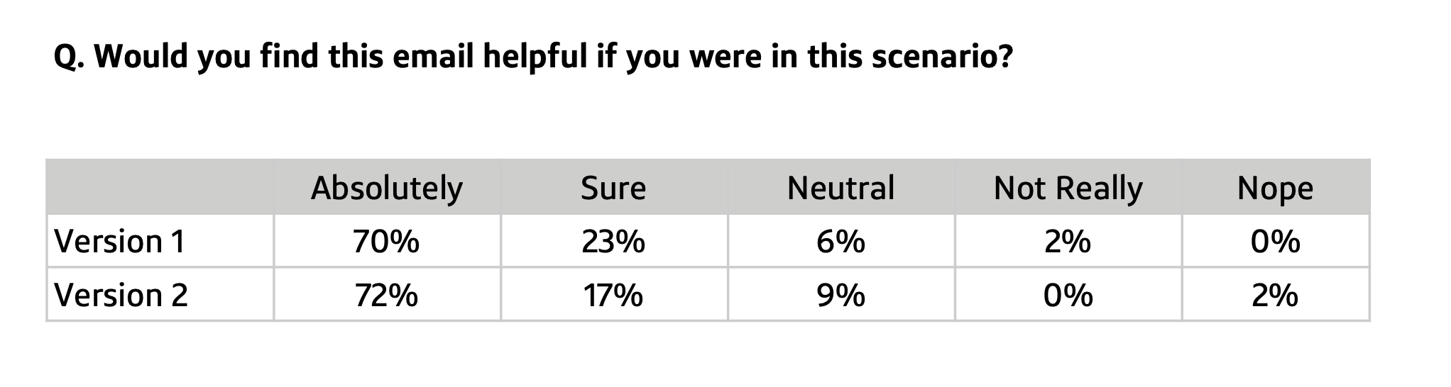
Research ResultsOur target audience segment preferred Version 1 (64% to 36%), with these supporting reasons:
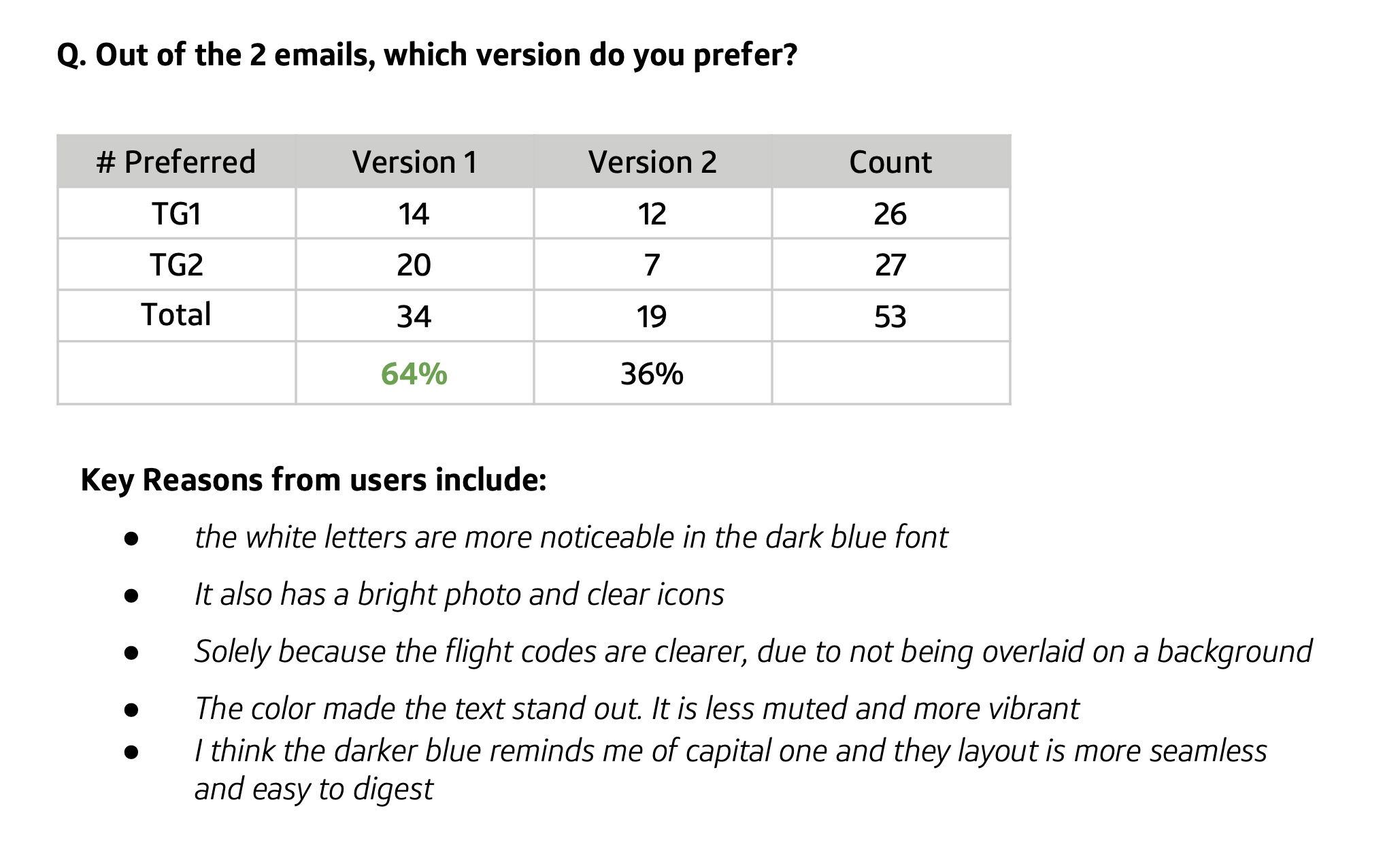
When shown both side by side, users chose Version 1.
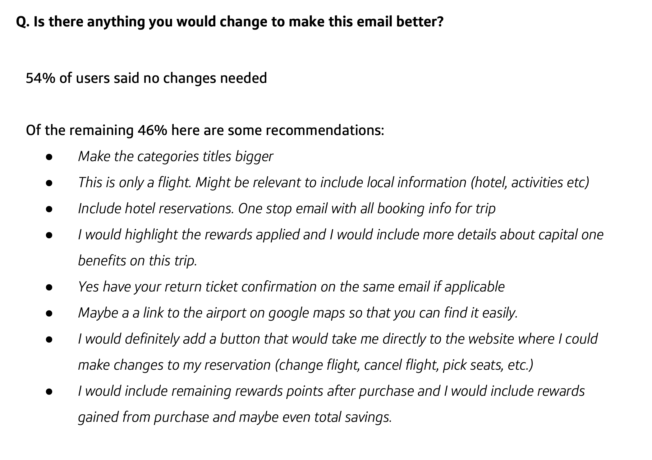
Reasons seem to indicate that it was more aesthetically pleasing and the dark blue background helped the white letters stand out more. Both versions scored well from a “helpfulness” scoring of customer sentiment. Of the requests to improve the emails, a key takeaway was to have a button that would “take me directly to the website where I could make changes to my reservation,” which we later implemented in the copy and design.
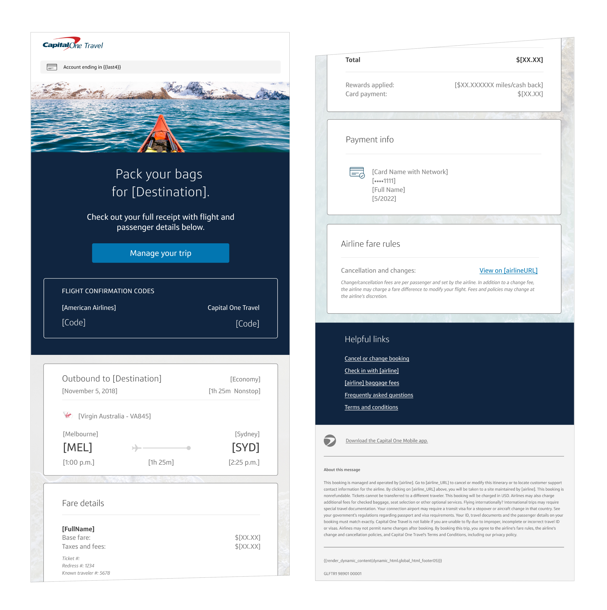
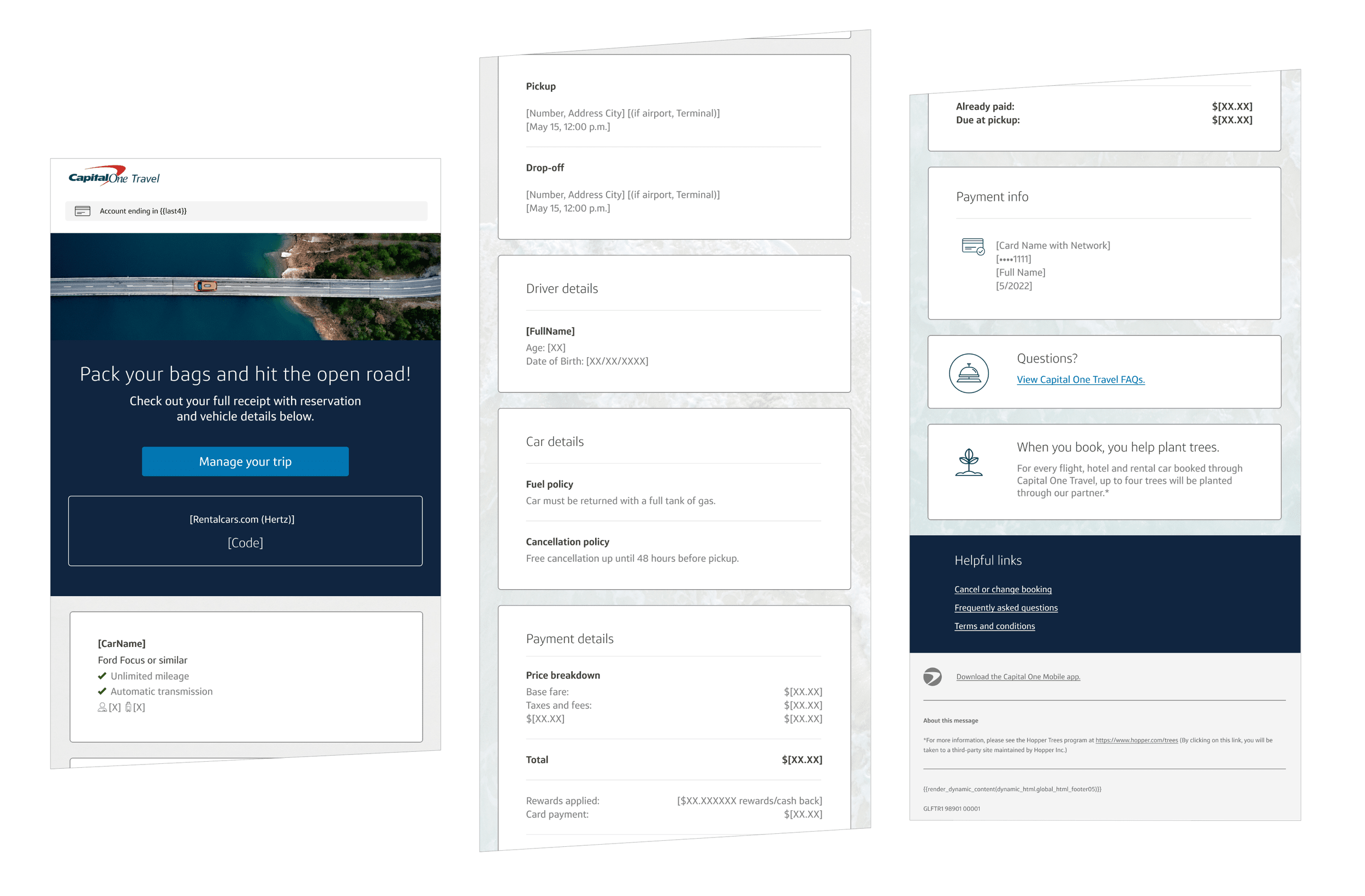
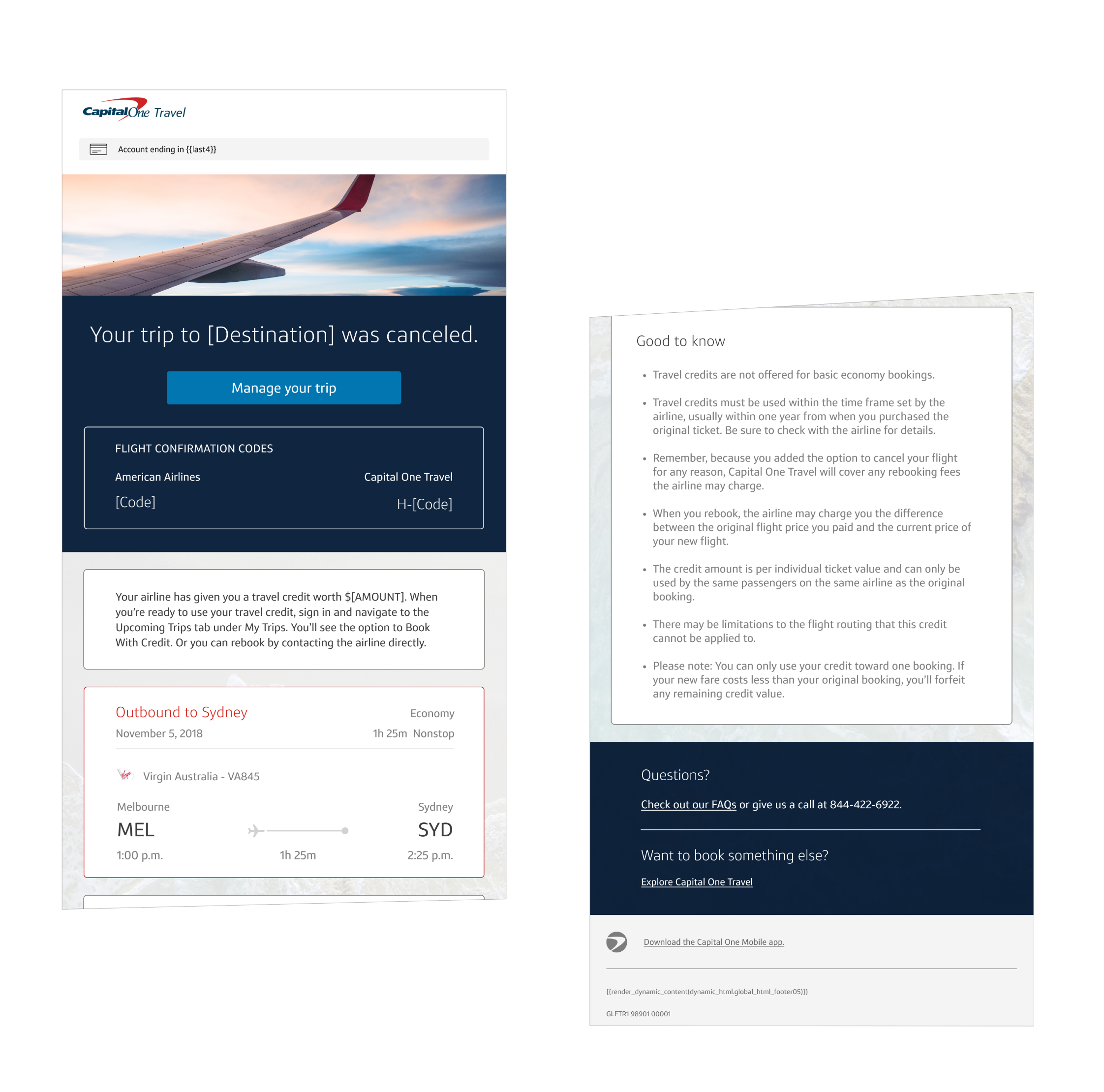
The Design

Other details
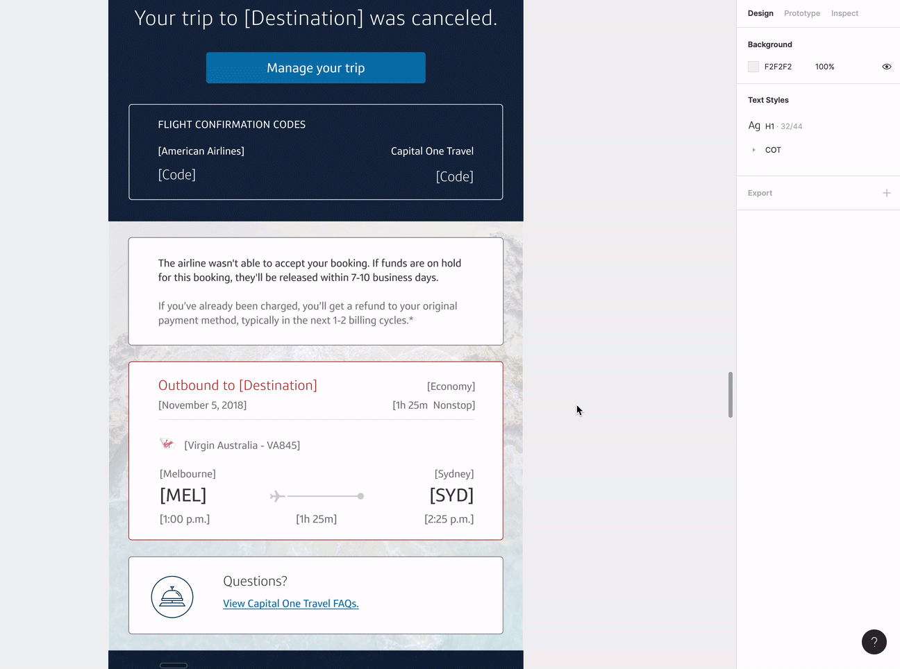
I used auto layout and component variables to make sure each component module could be easily swapped images, buttons, and texts.
This was crucial to align with our KPI of having 10 components per email.
I also created variable documentation for the developers so that they could easily know which images were links, where the variable data could be accessed, and if date variables needed hardcoded commas. I built the functionality of all of these auto layout templates.
How I mainted consistency with so many emails
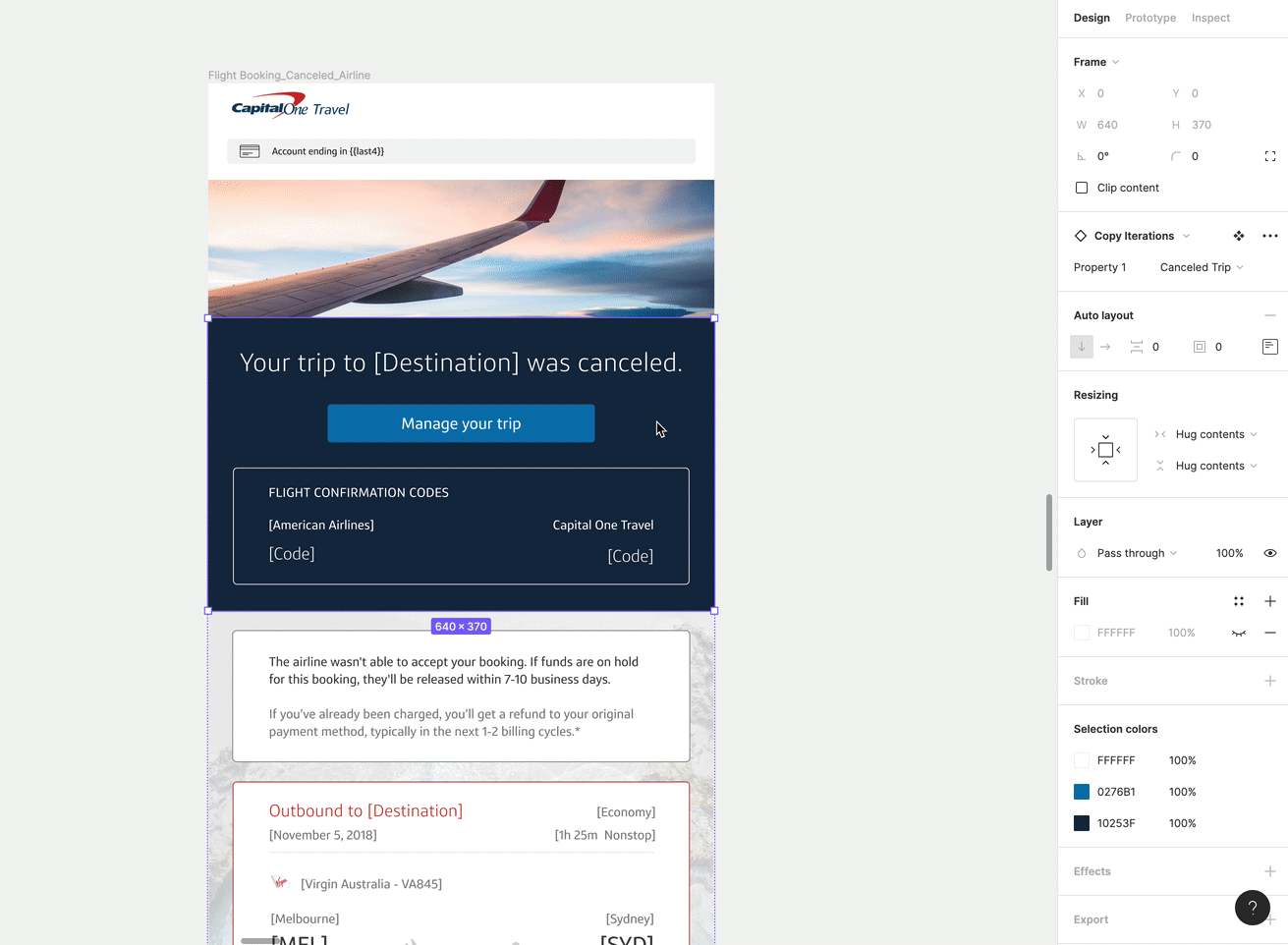
I even built my own Figma plugin (before AI was a thing!) in Javascript to help me make more effective sweeping changes to my emails. Check out Figma-Select-Elements here!
The impact & final results

This Capital One Travel servicing email suite reached an estimated hundreds of thousands of customers annually across transactional, alert, and automation touchpoints. Based on our benchmarks, these emails generally had open rates of 35–60% depending on whether they were marketing or transactional, significantly outperforming traditional marketing email. By introducing a modular, system-driven design across 63 emails, we improved clarity during high-anxiety moments, reinforced a premium brand perception, and created a scalable foundation for future feature discovery and growth, turning necessary servicing communications into trust-building product experiences.