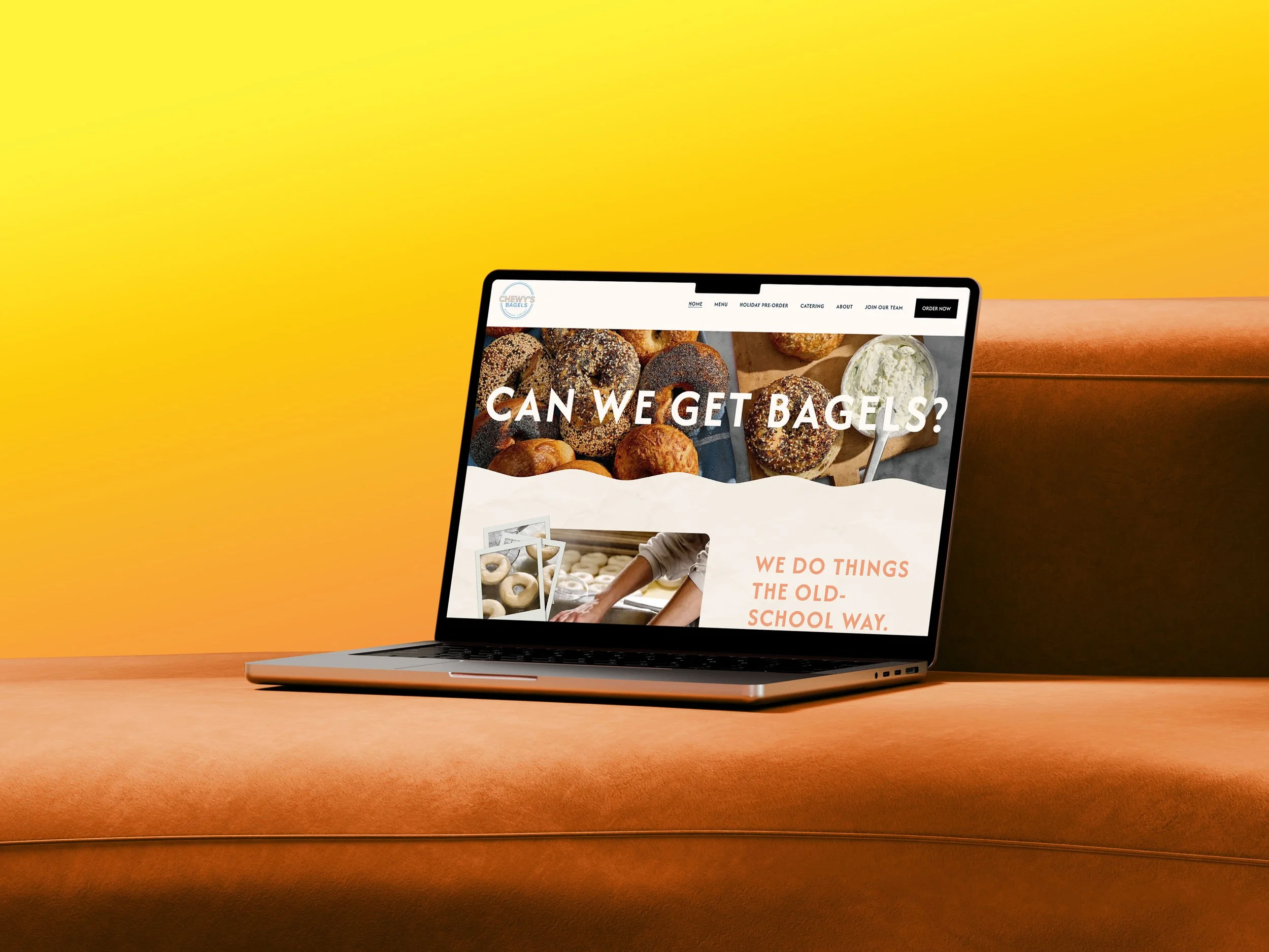
CHEWY’S BAGELS
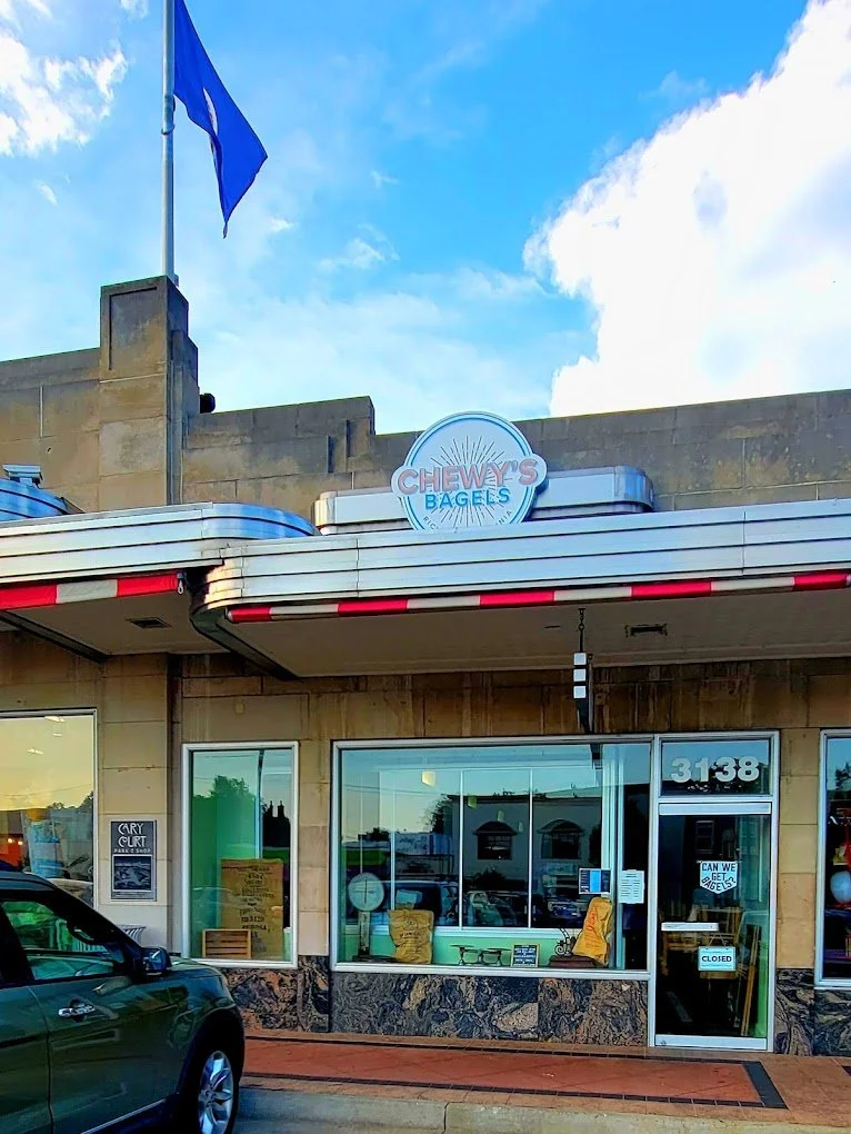
The ChallengeChewy's Bagels came to me with a problem many small businesses face: their website didn't reflect who they really were. Ashley felt disconnected from her digital presence, and operationally, the site was creating more headaches than solutions.
Last-minute catering orders were flooding in after hours, and the in-store process was scaling, but the website couldn’t handle the additional needs of the business. The existing site was functional, but it wasn't working for the business as it was scaling.
Key pain points
Brand disconnect between the physical shop and digital presence
Catering was by phone-only, with people trying to make after-hours and last-minute orders (major operational burden)
Limited visibility for new product offerings
No clear pathway for job applicants
Inefficient order intake process
Pain Points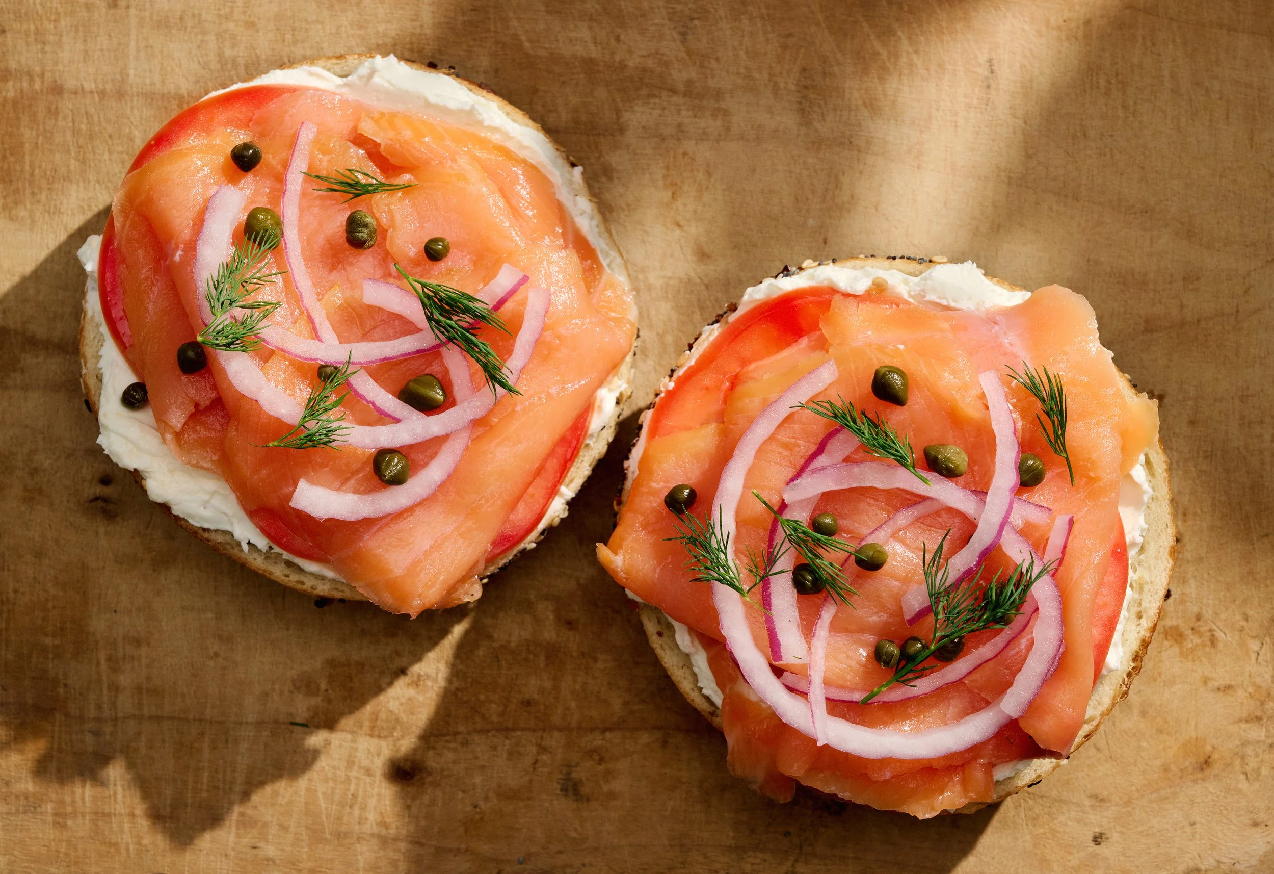
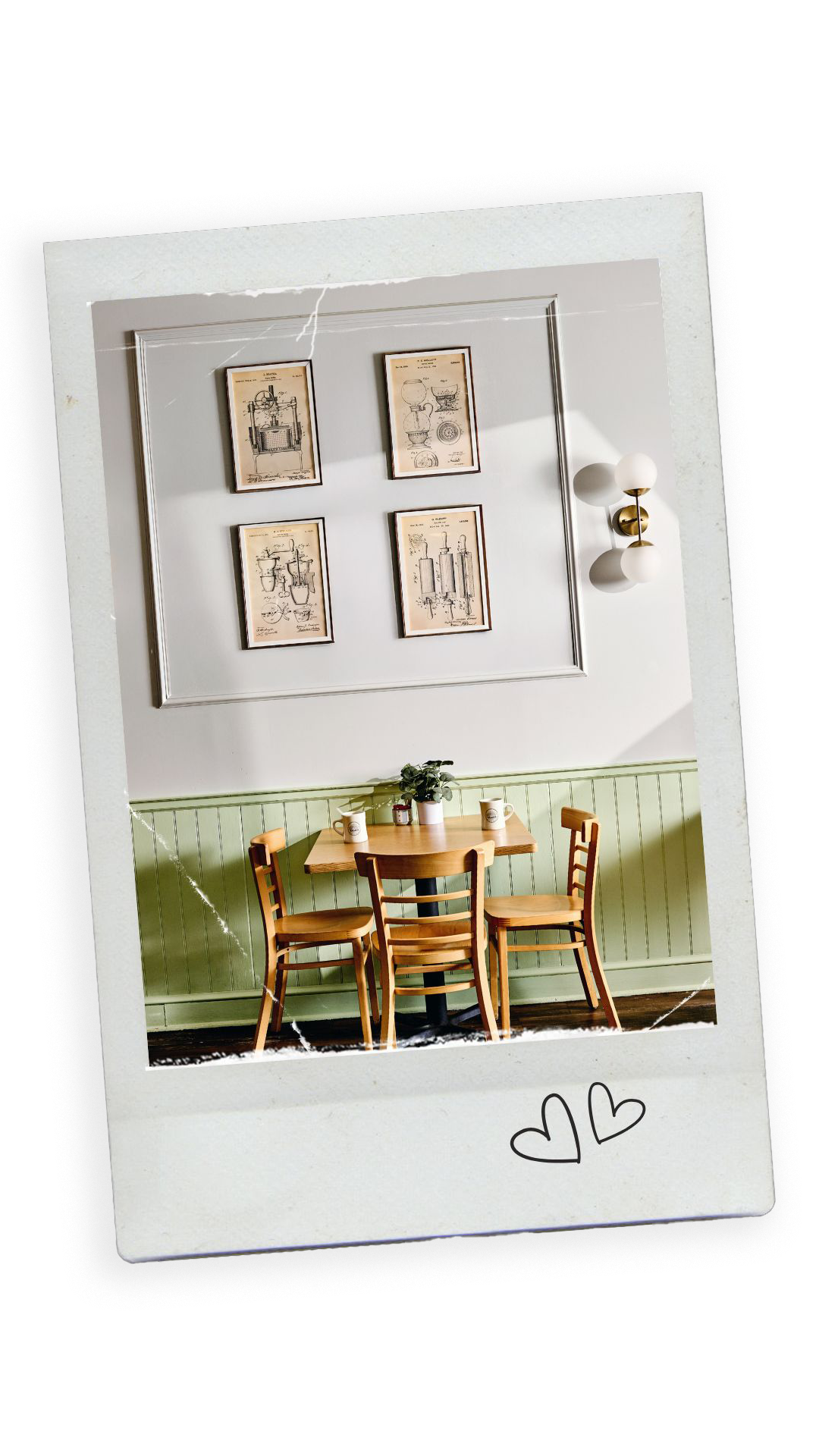
I started by understanding what made Chewy's Bagels special. Through conversations with the owner, I learned about their commitment to quality, the warmth of their in-store experience, and their growing catering business. The website needed to capture that same energy while solving real operational problems.
The strategy became clear: build a digital experience that felt as bright and welcoming as walking into their shop, while implementing smart guardrails that protected the team's time and sanity.
Discovery & Strategy

Visual Identity & Brand Alignment
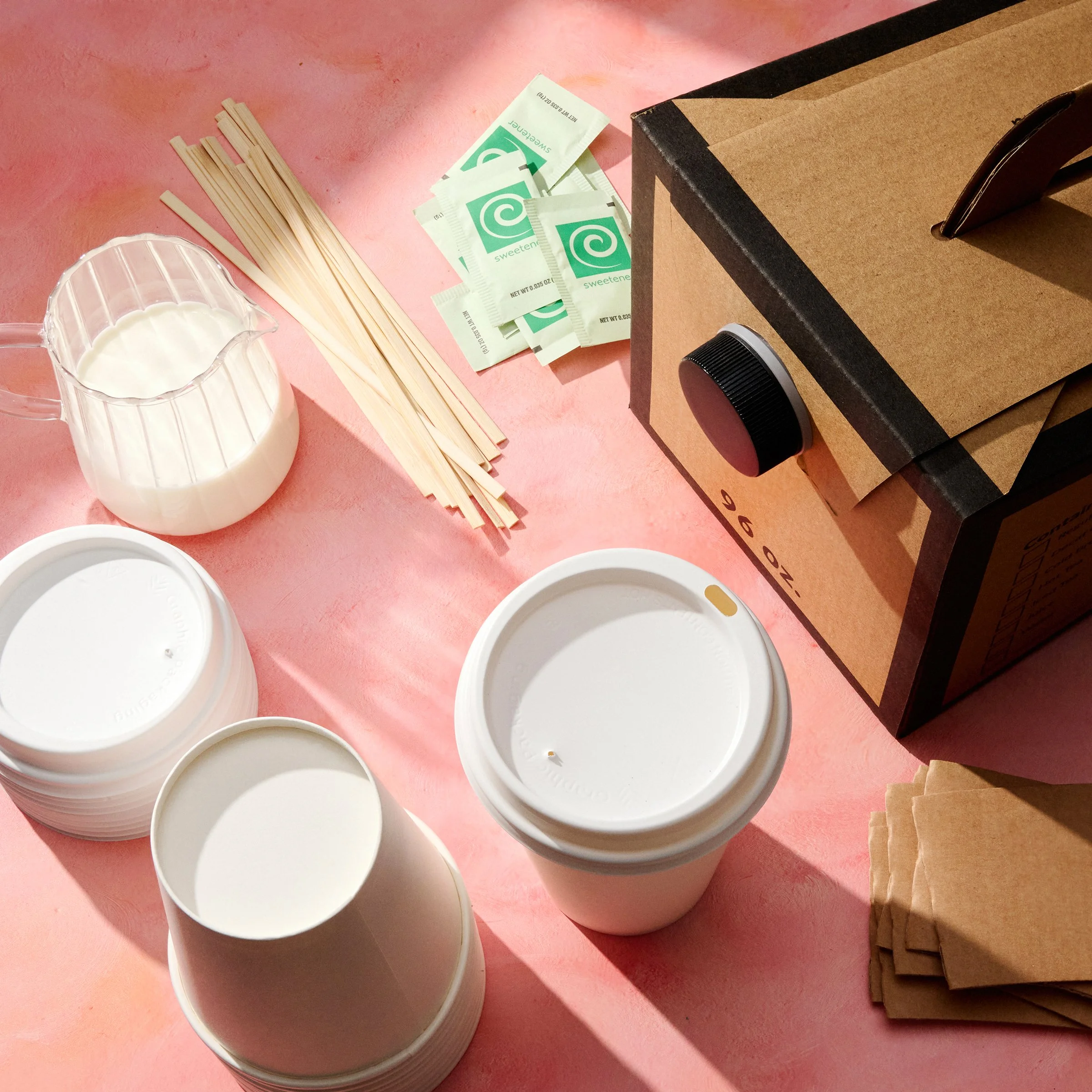
Working with local food photographers and stylists Fred+Elliott, we created a visual photograhy collection that emphasized freshness, brightness, and approachability. The new aesthetic captured the vibrant, welcoming atmosphere customers experience in-store, finally bridging that gap between physical and digital.
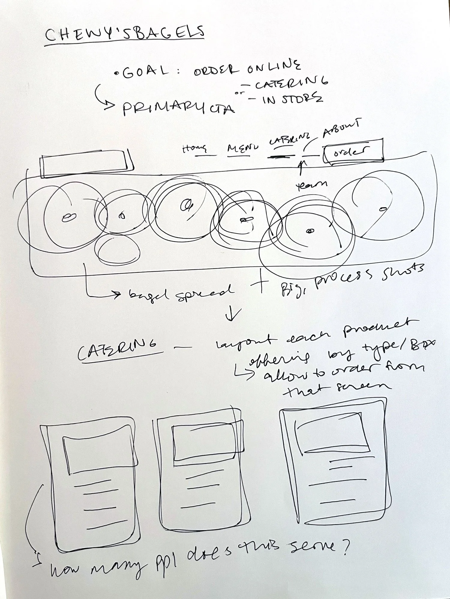
We created the architecture together based on how customers actually think about ordering bagels and catering. Because we wanted the primary action to order bagels online, we put that CTA at the top right for easy access. The new architecture organized content into intuitive categories, making it effortless to explore Chewy’s history, understand catering options, and get inspired by what Chewy's offers.
Information Architecture
Easy-edit menu
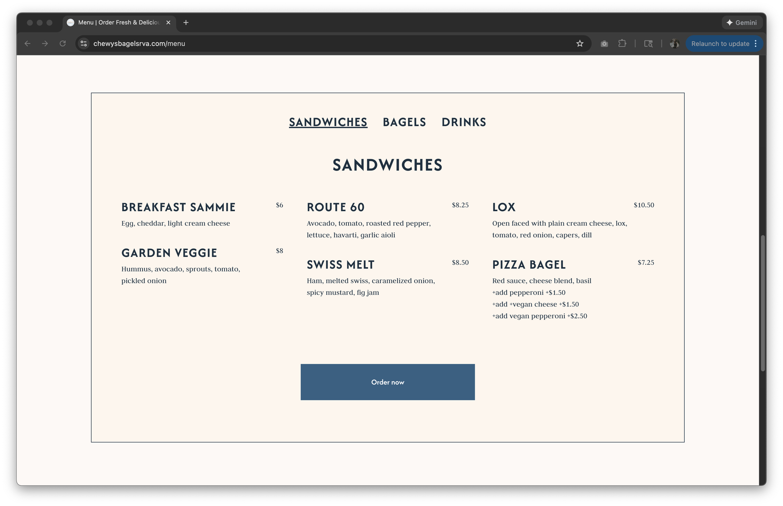
We also wanted Ashley to be able to update the menu on the site (Chewy’s used to just upload the menu as PDFs from the boards they printed), so I created a custom menu for her, where customers could toggle through the offerings easily and where she could update prices when items changed.

Custom-built catering system
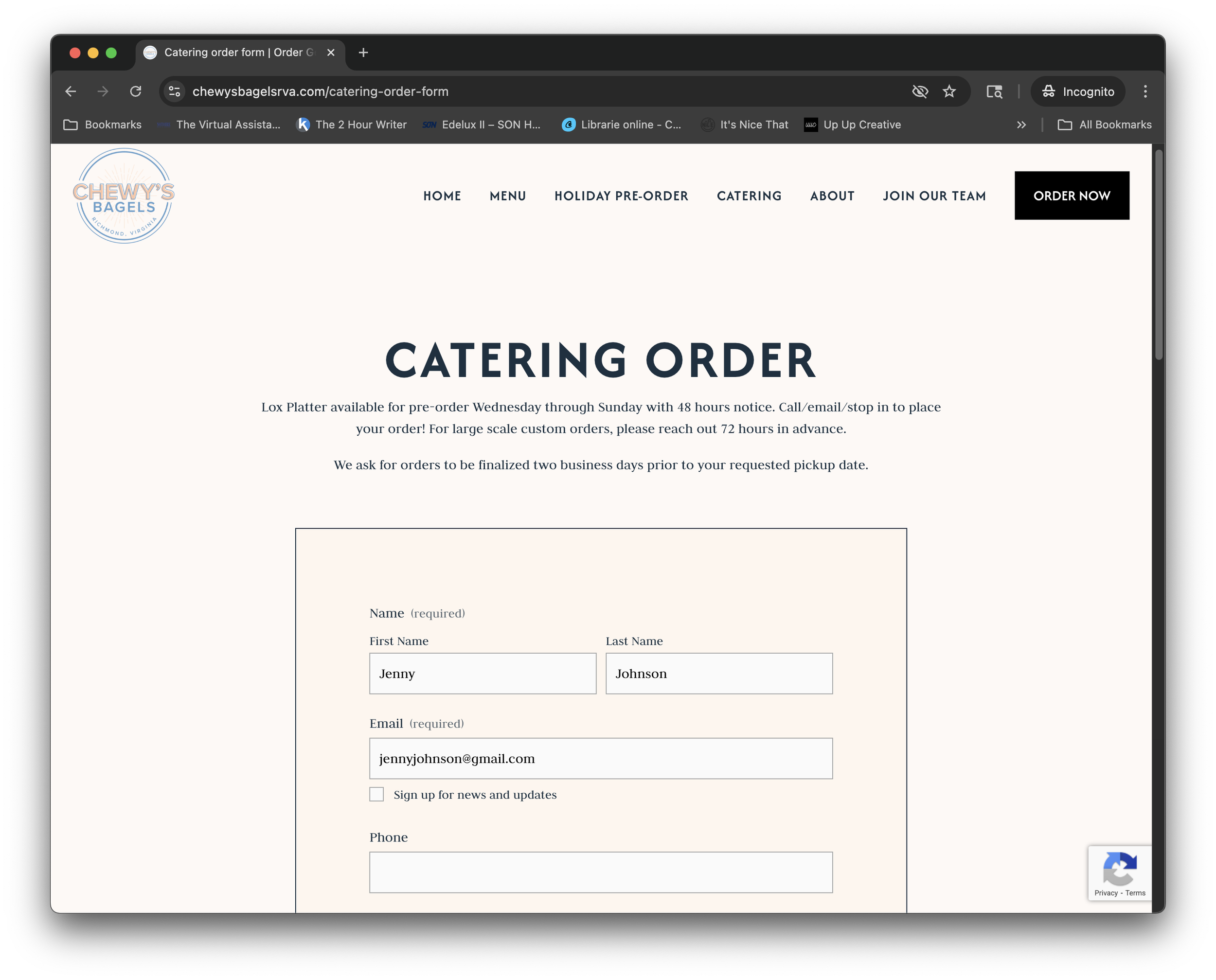
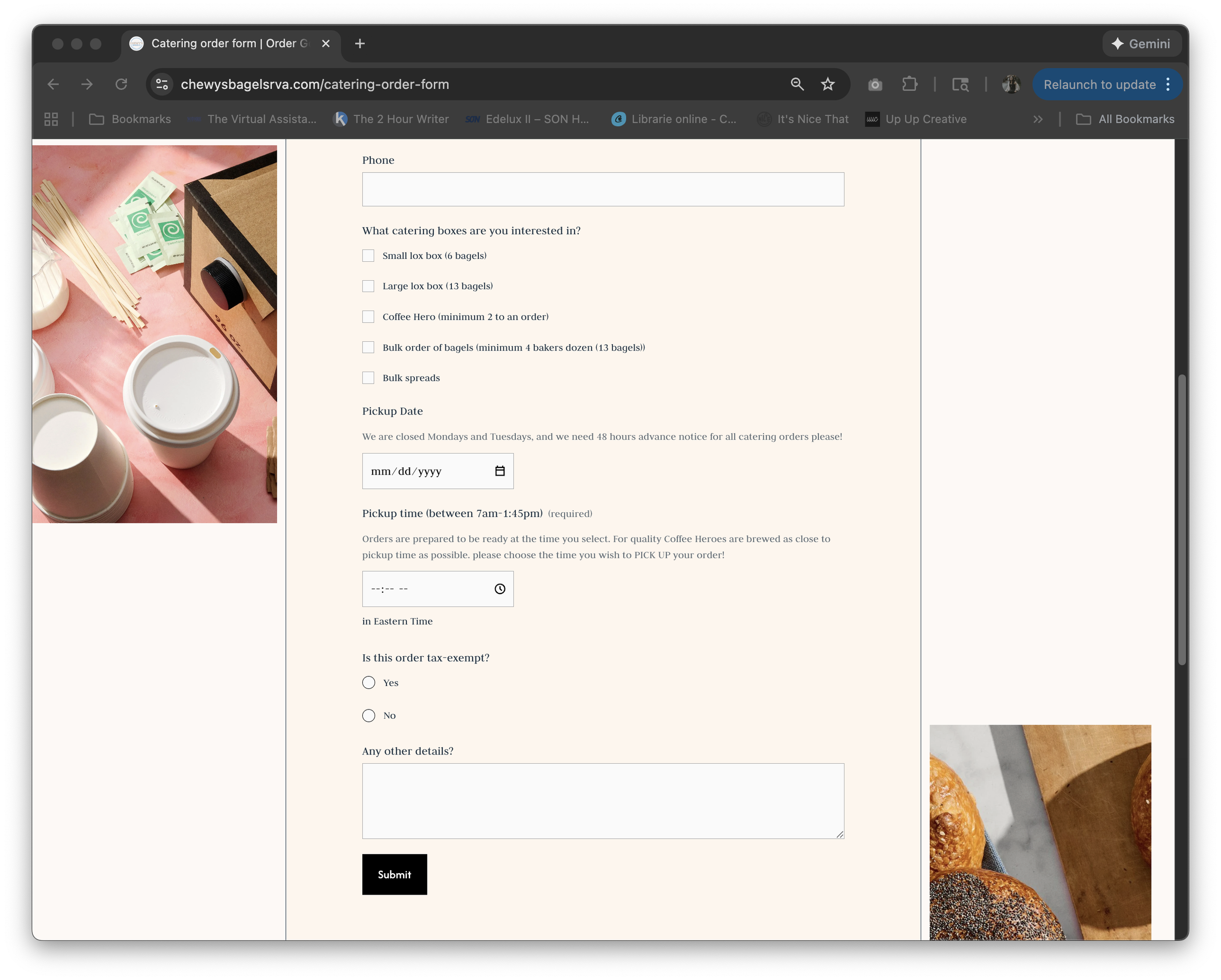
The redesigned catering form was a game-changer. By implementing smart time constraints using custom code, we eliminated after-hours requests and last-minute bookings that were stretching the team thin. The form now:
Prevents bookings outside business capacity
Requires adequate lead time for preparation
Consolidates all catering requests into one streamlined process
Makes it easy for customers to understand catering packages
The Little DetailsStreamlined Hiring
The dedicated "Join Our Team" page in the main navigation creates a clear pathway for potential employees, completely separate from the customer ordering flow. This removes confusion and makes it easy for job seekers to find exactly what they need without cluttering the main customer experience.
Technical Foundation
Built on Squarespace, every page was optimized for SEO with attention to page speed, mobile responsiveness, and search visibility. The clean, semantic structure and fast-loading images from Fred+Elliott ensure the site performs as beautifully as it looks. The integration with Toast Tab for ordering ensures a seamless handoff from browsing to purchasing.
The Results
The redesign has been fantastic, both qualitatively and quantitatively!
Traffic & Visibility:
Monthly website views grew from 3,000 to 6,000+ (100% increase)
Consistent month-over-month growth trajectory
Improved search rankings across key terms
Business Impact:
20% increase in catering conversions
15% increase in email subscribers (building a direct marketing channel)
Eliminated operational stress from poorly-timed orders
Qualitative Wins:
Owner finally feels her website represents her business
Team empowered by systems that work with them, not against them
Customer feedback praising the ease of ordering and browsing
Strong brand consistency between physical and digital presence


Key Takeaways
This project reinforced something I believe deeply: good UX isn't just about aesthetics or even usability; it's about understanding the complete ecosystem around a product. The catering form improvements, for example, weren't flashy design work, but they solved a real problem that was affecting the business daily.
By combining thoughtful design with smart constraints, authentic brand voice with clear functionality, and beautiful photography with strategic information architecture, we created something that works for everyone: customers find what they need easily, the team operates more efficiently, and the business grows sustainably.
Sometimes the best design is the one that simply gets out of the way and lets a great business do what it does best: make incredible bagels and serve their community.