NOT MFA
Branding Not MFA
Not MFA is an immersive, MFA quality course for people that don't have the time, resources, or desire to attend a university MFA program. Not MFA aims to give consumers to give the same high-quality instruction you’d find in a college classroom no matter the experience level of the writer.
Goal: Demonstrate the expert-level instruction of the program while also highlighting the hands-on instruction and focus on teaching the structure of a story.
The challenge was to develop a visual identity and website that: 1) reflects the authenticity of such a program 2) appeals to the target audience (women interested in writing a novel aged 25-45) and 3) can demonstrate the overall teaching mastery of the Not MFA team.
The solution was to create a bold, transportive, and challenging logo based on Matt’s ideal vision for Not MFA. This is an excerpt directly from our Core Brand Pillars workshop:
We all want to marinate our heads in the topics, ideas, and problems that matter, while reaffirming or denying our previous assumptions, models, modes of living. This process is where meaning is created and deliberately. We don't want to get torn to pieces in ideological wars or live in a shallow stew of sucrose nothingness. Let's avoid feeling alone in this strange world and engage with deep matters, produce thoughtful responses, and live our lives like a work of art. — Matt Cricchio
THE MARK
The mark represents the reaffirmation and denial of our previous thoughts and assumptions: two elements that are thought of together in certain contexts (reminiscent of King Arthur and other classic knight stories) and not at all (how often in your everyday life do you see a sword cutting through a book*?).
*If the answer to this question is more than a couple of times, please hit me up, because I’d love to hear more.


Pushing boundaries—elegantly
The client wanted a logo that is instantly recognizable as a symbol, yet contemporary to reflect the modern-day design and avant-garde nature of the course. Using a traditional yet charismatic typographic system, Not MFA is able to do just that. That, combined with the elegant and classic imagery, allows the clients to get into the headspace of engaging with deep matters and producing their own thoughtful responses to the classes.
Workbooks & Lead Magnets
NotMFA is the online course equivalent of a university-level experience at your pace and at a price you can afford.
But how do you get said clients to become interested in your course? And even more so, to actually buy your course?
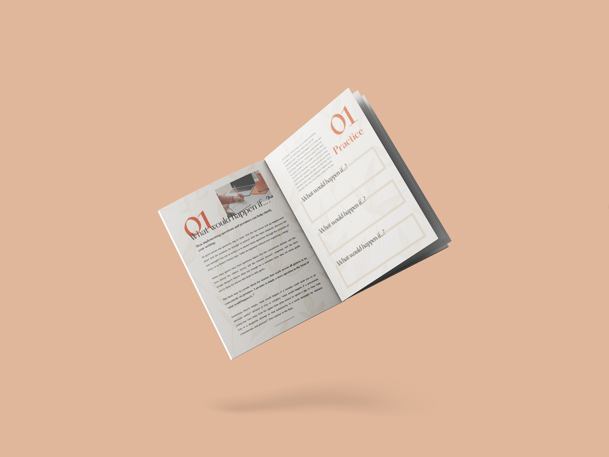
By providing lots of free value and resources upfront. I worked closely with Matt to develop a custom 12-page workbook for future writers that would engage with his target audience as well as increase his email listing to nurture warm leads.


