OCTOBER AUDIO
Branding October Audio
October Audio has gained prominence as one of the most up-and-coming guitar effects pedal companies on the East Coast.
Goal: Demonstrate the handmade qualities of the pedals while also adding an eclectic and quirky flair. Have a logo that can be perceived with many different styles of local art on guitar pedals and still be known uniquely as October Audio.
The challenge was to develop a visual identity and voice that: 1) reflects the diversity of their pedals and sounds 2) appeals to both household rockstars and professional audio engineers and 3) can functionally coordinate with a constantly evolving pedal repertoire.
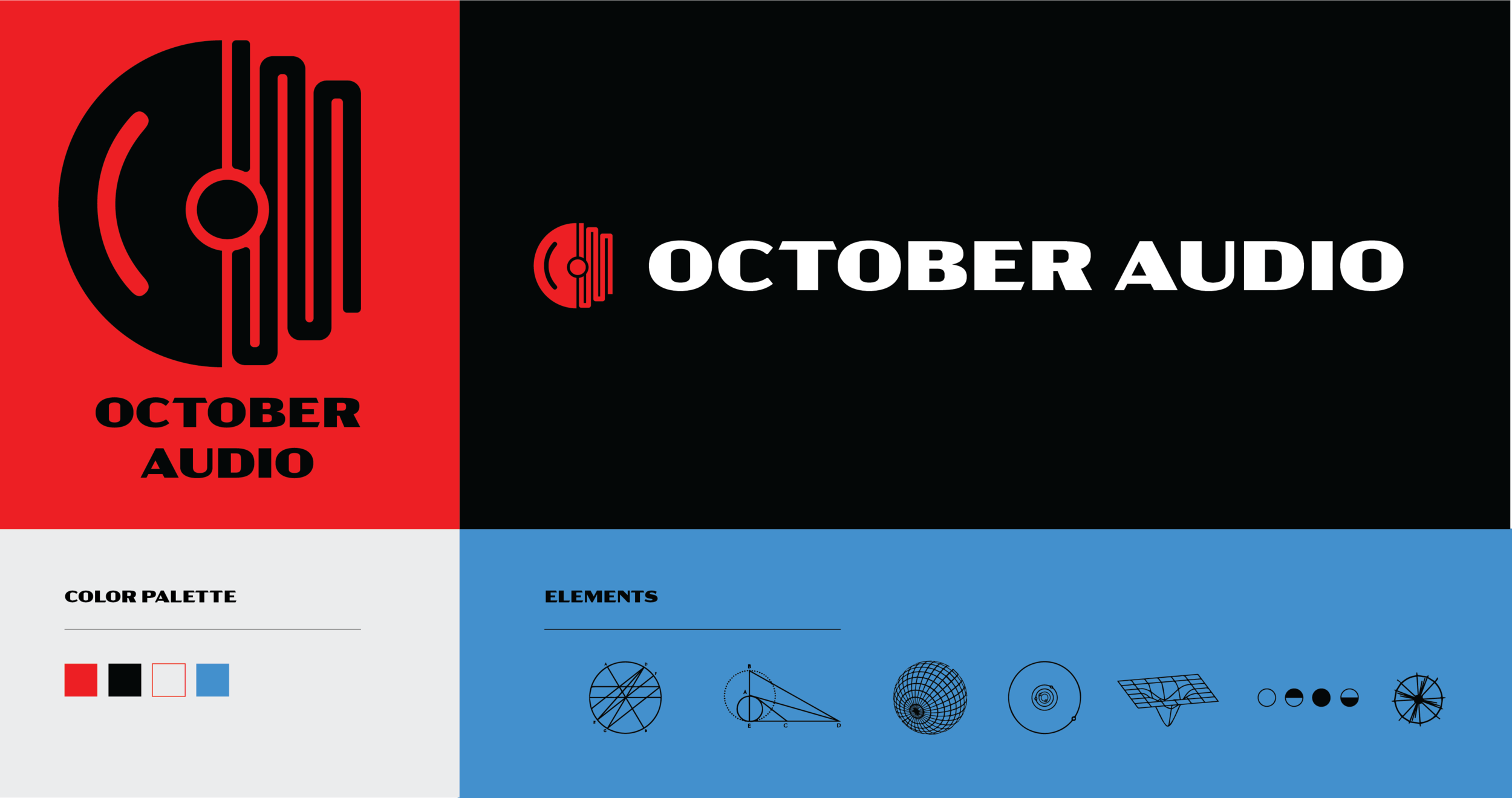
The solution was to create a collection of parts (synth waves, CD covers, color and typography) utilizing two of the simplest elements intrinsic to modular synth products—sine waves and circles.
THE MARK
The mark needed to exist in a variety of platforms—from the smallest digital to the largest building banners and everything in between. Formally, it combines sine waves of the pedal’s mechanical circuits using point and line and sets up the first critical building block of the visual brand. The circle is a nod to CDs and the nostalgic, classic timeless vibe that October Audio portrays.


Creating a flexible system
Using a uniquely textural and iconographic design system, October Audio has a wide range of options for its changing sounds and modular devices. That, combined with the elegant and classic typography, allows us to focus on the robustness and timelessness of the pedals themselves.







The Pedals Themselves
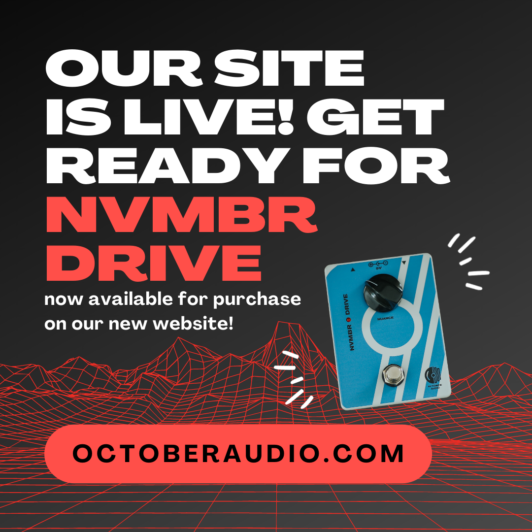
The NVMBR Drive’s pushed tube amp delivers some of the most rewarding signal breakup, from light drive to overloaded fuzziness. Catnip for guitarists, it just feels good to play. Because other humans and animals sometimes don’t agree, it’s not always possible to dime an amp.
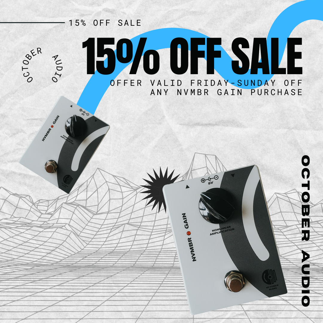
The NVMBR Gain is a new clean & dirty amplification system that both boosts clean volume and adds sparkly, jangly grit. This device essentially acts like a tiny amp- volume increases transparently until the breaking point where overdrive begins.
Because these pedals are one family, we used the October Audio logo as the flagship design that will display across all three as they are placed (and played) together.
Coming soon: October Audio Fuzz!
October Audio mntns pedal - a phaser, vibrato, and gain all in one!


